I recall burning three or four weeks of a sabbatical getting Saccade.com on the air with Wordpress. So much tweaking…
Somewhere… over the (simulated) rainbow…
A few days back, I simulated how light propagated in a single drop of water, but with a number of problems. First of all, it didn’t simulate the Fresnel equations, which describe how light is reflected and refracted at the interface between two media. This meant that in my simple model, no light is actually subject to total internal reflection, and no light was scattered back in the direction that the light originated. This is an important effect: without it, you cannot see rainbows. It also assumed a single index of refraction, so we couldn’t see how the reflection and refraction change as a function of wavelength.
So, I decided to fix both problems, and run a simulation to see if I could capture some interesting features of rainbows by direct simulation.
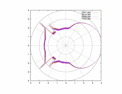
To keep you interested (if possible), I’ll merely give the picture, then explain it. (Click on it to view it full size).
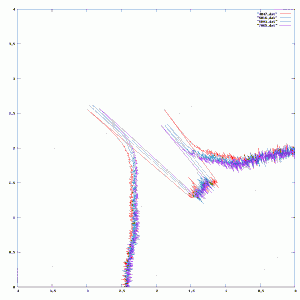
It’s hard to see the detail in the area of interest, so here’s a better version, zoomed in (click to view bigger):
This describes the distribution of light in each outgoing direction, assuming light coming in from the left. There are four different plots, ranging from the shortest wavelength (4047 Angstroms, or deep violet) to the longest (7065 Angstroms, or deep red). (Sadly, there isn’t any correlation between the plot color and the wavelength, you have to look at the legend to interpret things properly.) I got these plots by determining the index of water at each wavelength, and then simulating via Monte Carlo techniques the resulting outgoing distribution by tossing 10 million simulated photons at the drop. At each surface interaction, it determines what the ratio of reflected to refracted light could be, and then take one path or the other based upon a weighted coin flip. The final outgoing directions are binned, and we take the log of the count in each bin to produce the distance from the center in the polar plot.
This plot isn’t the most pretty thing you’ll ever see, but you’ll actually find a number of interesting things. First of all, you’ll see that there are two rainbows represented. The inner one is the brighter, and the outer one is significantly dimmer (you might estimate that it contains 1/10 as much energy, since it appears about 1 unit lower and I used log based 10). The inner bow has violet at the inner side, and red at the outer side while the outer bow is reversed (red on the inner radius and violet on the outer radius). There is also a distinct lack of light between the two bows. The amount of light reflected in between the two bows is less than that scattered outside them. This is a phenomenon called “Alexander’s band”.
I thought this was a fun experiment. I could work a bit harder and actually produce the appropriate colors and intensities by some more computer graphics magic. Perhaps that will wait for some other day.


Comment from Alan Yates
Time 9/5/2010 at 3:15 pm
Very interesting Mark! Nice that the 2nd order just falls out of the simulation.
Would be interesting to do a horizontal slice projection and integrate enough to see the actual bows. Would complicate the simulation I guess, requiring a spherical model rather than a circular one.