I recall burning three or four weeks of a sabbatical getting Saccade.com on the air with Wordpress. So much tweaking…
An IBM 1403 font…
A few days ago, I was playing around with my Raspberry Pi, trying to get a new, freshly compiled version of the TOPS-10 7.03 monitor running. I was having some difficulty with it, as it appears that a bug had crept into the code that simulates the DZ11 serial ports as telnet connections, and I could no longer login from “remote” terminals. While I was grumbling about that patiently awaiting a fix to appear on the simh github server, I started thinking about other computers. (Long time readers may remember that I suffer from occasional bits of technological nostalgia, having previously written an emulator for the PDP-1 so I could play SpaceWar! and written all sorts of fun code for the Atari 2600.)
So, I started looking into the IBM 1401.
Recently, the Computer History Museum completed a restoration project to bring an IBM 1401 back from the dead. Actually, they have now have two. Each weighs about 4 tons, and the 1401 was quite possibly the most plentiful computer back in 1964 when I was born.
It’s a really odd machine. You can read more about it here. It was mostly implemented using diode-transistor logic (now you know where my recent poking at DTL logic came from). It had core memory, with up to 16Kbytes! The first machines where announced in 1959, and construction ceased in 1971 as the IBM/360 architectures became dominant.
But all this is really an aside. I was thinking about my DEC experience, and started thinking about the line printers we had back then. Unlike the quiet woosh of today’s laser printers, these where heavy, loud, mechanical monstrosities, but they were fast. They could spew out a printed sheet of green bar paper in about six seconds, and if you had lots of form feeds, could eject 75 inches of paper each second. I remember seeing someone do that at the University of Oregon (probably on a DEC LP20) and you could visibly see the stack of fanfold beneath the printer drain away).
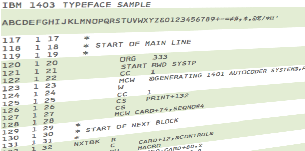
I suspect that the printer hooked to our DEC-1091 at the University of Oregon in the early 1980’s might have been an LP20, but I got hooked on researching the technology with some judicious googling, and found references to the IBM 1403 printer, which was commonly paired with the IBM 1401. I ran across this page about the IBM 1401 restoration, which included the following example print sample:
I liked it. So, on Twitter, I idly mentioned that I wondered if anyone had created an IBM 1403 inspired font.
And it turned out that a hacker friend of mine with diverse interests, Jeff Kellem (@composerjk) heard my call. Among his interests and talents is typography and font design. Jeff took some print samples and started working on a 1403 inspired font. While he’s not ready to release yet, the preliminary results look awesome:
What is even cooler is that Jeff wrote up some notes on his blog about how he did it, as well as some additional inspiring links about the 1401 restoration project. Great stuff, and thanks to Jeff!
Comments
Comment from BobT
Time 2/14/2013 at 4:05 pm
A realistic font would not have the letters in an even line, they were always up and down a bit, and usually the same characters would be always up or always down.
Comment from ChrisJ
Time 5/2/2015 at 1:40 pm
BobT: you would have to make two fonts, one for the original machine from the factory with all the characters in perfect alignment and another like you describe for after the bands have been replaced!


Pingback from An IBM 1403 Printer Inspired Typeface (in progress) | Slanted Hall
Time 1/23/2013 at 3:36 pm
[…] twitter about the existence of a typeface reminiscent of the IBM 1403 line printer. Mark wrote about his path to this query. Stan Paddock (his 1401 blog) had created a scanned font (artifacts […]